By Chefs for Chefs

Digital Service for Inspiration of Purchase - eCommerce

"We get into the minds of our chefs to understand their needs and transform this into amazing user experiences that drives engagement, conversion, and sales."
- Roel (Global Operation Manager)

User Story

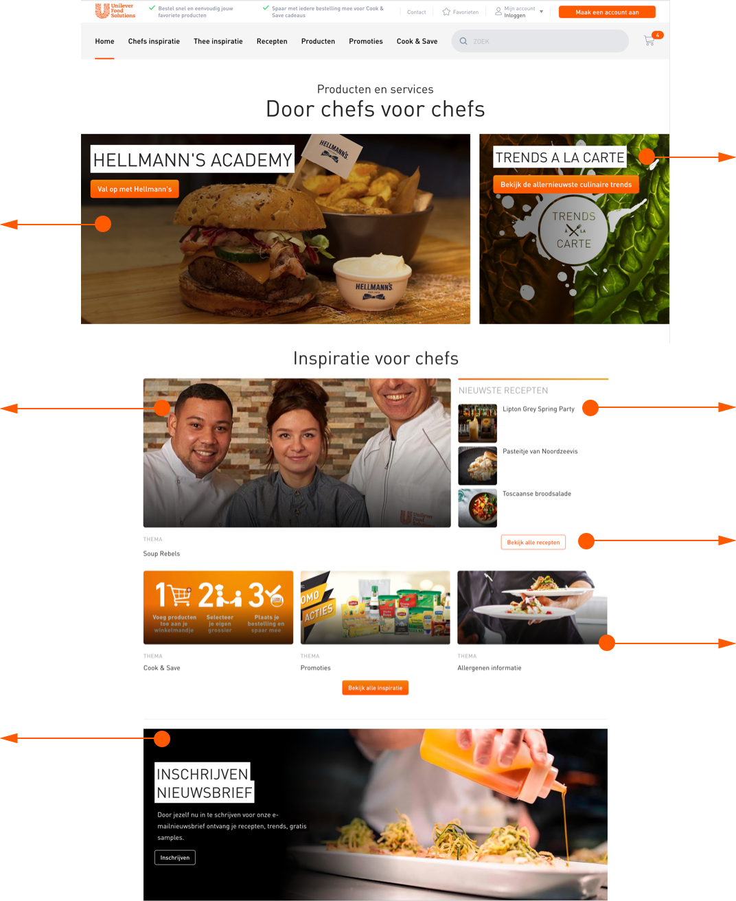
Chef has a very busy lifestyle, they need to make fast decisions for hundreds of clients everyday on how and what to do with ingredients of their dishes. Inspiration of purchase with clear information guidance is a key to attract chefs to the website. The Unilever Food Solution aim to assist chefs to move their pace forward faster with good quality delivery.

Client

Unilever Food Solution - Global Headqualter

Time

June 2018 - 24 hours of proposal work

Role

UX Designer

Business Briefing

Unilever Food Solution focus on food packaging and distribution network before 2014, however, the trend of market is shifting towards digital services. In order to stand on top of the competition, Unilever is ready to make a leap regarding to the presentation of product information to help chefs make good choices in time, as well as to improve the visual engagement so that Chefs can be more inspired to purchase Unilever products. The aim of this proposal is to initiate UX & UI improvement base on the current Unilever Food Solution website.

Toolbox

Sketch, Personas, Trend Analysis

Team

1 UX Designer (Me)
1 Product Owner (Client Lead)

Design Process

1. Define Business & UX Goals

Create space for promotional contents
Easy for chef to find specific products
Easy for chef to purchase on product lister page (tile info.)
Easy for chef to see attractive offers

2. User Analysis Result - SEO keywords

3. Trend Analysis - Learn from Industry Leaders

Clear menu indication on 2 layers of navigation bar.
Clear promotional message.
Clear call to action button.
Use image slider to show more offerings with enough screen space.
No reference. Unilever product tile has unique needs.
High image quality & correct photo lighting to showcase the product quality.

4. Current Website Lab Scan - Point of Improvement

Attractive 1st brand impression is missing, no promotional contents.
Overlapping promotional messages, not efficient use of space.
Cannot see product tiles on the 1st screen.
Tile information improvement base on allergy info. & USP is missing.

5. Ideation - Hand sketching

6. High Fidility Wireframing - UX Design

UX Details & Assumption

Before
After
Design A
Design B
Global framework (layout) + local content (image)

Tags (upper right hand side) for promotional strategies
Clear call to action with attractive offers
Assumption: USP description is more relevant than rating at time of purchase -> User validation testing

7. Preference Testing Result- User Validation

8. Final UX Conclusion from User Testing

Design A
Relevant information for chef.
Clear description, no guessing.
Tags of allergy information are relevant in decision making.
More text compare to B, would like to have layout B but info. A.
I know exactly what I want to purchase so description is not that necessary; rating is more relevant because it is about other’s opinion.
Design B
Clean layout.
More graphical compare to A.
Rating is important if it is relating to customer info.
Rating is nice to see.
Rating is not relevant info., the purpose is vague.
I have my personal cooking style, other people's rating is their style, not relevent to me.
Additional Feedback:
1) The cook credit should be closer to the price tag, because it is relevant to the amount of spending. I want it to be on the right hand side because people read from left to right, and I would like to see the product price first before going to other info. The credit icon is too much in my face. 
2) The allergy tags are great, super important to make purchase info. 

1. Define Business & UI Goals

Inspire the first time visitor to sign-up & subscribe
Display content are inspirational to the chefs
Persuasive recommendations
Other: improve information tags; improve visual design

New Logo Design

Unilever food ingredients that we serve to the customers on a plate + color fusion of joint global creativity.

Deepen brand impression in Chef's mind: 
Refreshed brand image on Unilever Food Solution branch.

2. Digital Trends in Food Website

Looking at the top 50 most appetizing design for food websites (by Intechnic), it is obvious that image based design is the most effective way to inspire Chefs to smell and taste the food from the image trigger. The pictures of food are clean & appealing, with ambience of stories to tell.

3. Website Lab Scan - Point of Improvement

Black mask on top of the image makes the food looks dirty & unattractive. Color tune of the image is not designed, not a visual candy.
Unclear what would be the next page after clicking on this image.
Visible black line on the black mask filter, not neat. The sign-up screen should be at the top of the webpage if it is one of the business goal. There is signup screen at the footer already, too close together without benefit.
Users are lost in seas of overview, double banner is not recommended according to industry standard.
Find a better way to combine text & image. The uneven distribution of empty space without a purpose, makes the reader nervous.
Button not visually aligned.
Some images are with sharp corner, some with rounded corners, it is subconsciously unease to the reader. Make a choice.
Information architecture is unclear, users might find it messy instead of inspired to sign-up.
Image based content is proven to be more inspirational according to food website trends. Bolder use of the image space is necessary.
More persuasive personalized offering is needed. Use persona info. to tailored the search experience.
Other: there are code bugs on break points & pixel alignment; info. architecture should be reorganized. (But both point are out of the scope here.)

4. Define UI Specifications

Desktop:
1440px width (Smallest HD screen resolution)
12 column - 82px margin, 88px column, 20px gutter
Mobile:
320 px width (iPhone SE - smallest mobile screen size now)
4 column - 68px column, 16px gutter width

5. Ideation - Hand sketching

6. Final UI Design - Mobile & Website

UX Design - Product Tile Page
- Global framework on layout, flexible local content on image
- Smart use of banner space & CTA
- Product tile design AB test validation
UI Design - Homepage Redesign
- UI specification for industry standard
- Image based design to trigger Chef's imagination
- Inspirational tags for search tailored to personas

Get Inspired, Unilever Food Solution

BACK TO TOP